前言
自 WordPress 5.0 版本开始,Gutenberg 编辑器成为了 WordPress 的默认编辑器,代替了之前的 Tinymce。新的编辑器将一切区块化,可以快速地以可视化的形式编辑区块,可以取代大部分短代码,并使插入相关内容的体验提升了很多。
最近给 Argon Theme 加上了 Gutenberg 编辑器支持,因为网上关于这一块的中文文档很少,所以在这篇博文记录一些需要注意的地方。
本文以 Argon 主题为例。
开始
Gutenberg 编辑器使用了 React 来实现,在 wp.block 中暴露了一些接口。Github 上已经有了相关的轮子 create-gutenberg-block,不妨使用这个项目搭建脚手架。
npx create-guten-block project-namecreate-gutenberg-block 生成项目时是作为插件生成的,将其放在 plugin 文件夹下可以直接作为插件激活。
如果要将其作为主题的一部分,可以删除 plugin.php,并将 src/init.php 中的内容写入主题的 function.php 中,注意路径变动后函数中的路径要修改。
该文件中在博客前台和后台都注册了 style 和 script,可以视情况移除,只保留后台的,而将前台的样式合并进主题的样式,避免文件冗余。同样的,该文件 register_block_type 函数中,也可以将添加到前台的 style 移除。
function.php 中相关代码的例子:
function argon_init_gutenberg_blocks() {
	wp_register_script( //注册编辑器 JS
		'argon-gutenberg-block-js',
		get_bloginfo('template_url') . '/gutenberg/dist/blocks.build.js',
		array('wp-blocks', 'wp-i18n', 'wp-element', 'wp-editor'),
		null,
		true
	);
	wp_register_style( //注册编辑器 CSS
		'argon-gutenberg-block-backend-css',
		get_bloginfo('template_url') . '/gutenberg/dist/blocks.editor.build.css',
		array('wp-edit-blocks'),
		filemtime(get_template_directory() . '/gutenberg/dist/blocks.editor.build.css')
	);
	register_block_type( //注册区块
		'argon/argon-gutenberg-block', array(
			'editor_script' => 'argon-gutenberg-block-js',
			'editor_style'  => 'argon-gutenberg-block-backend-css',
		)
	);
}
add_action('init', 'argon_init_gutenberg_blocks');
这个例子中,Node 项目位于 gutenberg 目录下,构建生成的 js 和 css 位于 gutenberg/dist 目录下。
注册区块分类
在 Argon 主题中,所有 Argon 主题注册的区块都被分到了 Argon 分类中。Wordpress 不会自动创建相关的分类,需要预先注册而不是直接在 js 中设置。Wordpress 采用 block_categories_all Filter 来添加自定义分类[1]。
Argon 注册分类的相关代码:
function argon_add_gutenberg_category($block_categories, $editor_context) {
	if (!empty($editor_context->post)){
		array_push(
			$block_categories,
			array(
				'slug'  => 'argon', //分类唯一标识
				'title' => 'Argon', //分类名词
				'icon'  => null, //分类图标 (似乎并没有显示图标的地方)
			)
		);
	}
	return $block_categories;
}
add_filter('block_categories_all', 'argon_add_gutenberg_category', 10, 2);
添加后,Gutenberg 编辑器中出现了 Argon 分类。
注册区块
运行 npm start,文件的修改会被自动监听并实时构建。
进入 src 目录,文件结构如下:
src
│  blocks.js //在此文件中引用汇总区块
│  common.scss //全局 CSS
│  init.php //作为插件时的初始化 PHP,作为主题可以删除了
│
└─block //一个示例区块
        block.js //该区块的 JS
        editor.scss //区块在编辑器中的 SCSS
        style.scss //区块在前台的 SCSS,作为主题可以删除了
示例区块只有简单的固定 HTML,可以参考但意义不大,可以删除了。可以看到,该区块主要从 wp.blocks 中引入了 registerBlockType 函数,并调用其进行注册。
下面以 Argon 中的 alert 区块为例。
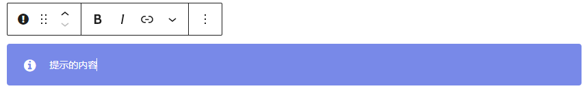
新建一个目录 src/alert,新建 src/alert/alert.js、src/alert/editor.scss。
在 src/blocks.js 中引用 alert.js:
import './alert/alert.js';在 alert.js 中,先引入必要的组件库和 CSS:
import './editor.scss'; //编辑器中的 CSS
import {
	RichText,
	InspectorControls
} from "@wordpress/block-editor"; //引入编辑器组件
import {
	ColorPalette,
	TextControl,
	Panel, PanelBody, PanelRow
} from '@wordpress/components'; //引入 UI 组件

const { registerBlockType } = wp.blocks; //从 wp.block 引入 registerBlockType 函数
@wordpress/block-editor 是 Gutenberg 编辑器的组件[2],用来实现富文本编辑等; @wordpress/components 是编辑器中的 UI 组件[3],用来实现右侧栏的颜色选择器、输入框、开关等。
wp.block 是编辑器注册的全局对象,其中的 registerBlockType 函数用来注册区块,下面介绍该函数。
registerBlockType
这个函数是注册区块的主要函数,传入两个参数,第一个参数是区块的唯一标识符,例如 argon/alert。推荐以这样的形式进行命名,同一个主题/插件中,斜杠前面的字符串保持一致,后面的用来区分不同区块。第二个参数是一个对象,用来声明该区块的信息。
下面对第二个参数中的一些参数进行解释,具体详尽的解释可以参考官方文档[4]:
title
字符串,必须,该区块的标题,例子中为 argon
description
字符串,可选,该区块的简短介绍
icon
字符串,可选,该区块的图标类名,图标为 Dash Icon 中的图标,例子中为 warning。
category
字符串,必须,该区块的分类,在例子中是前面注册的 argon 分类。
keywords
数组,可选,每一项是一个字符串,代表区块的别名,可以用这个数组中的字符串搜索到这个区块。例子中是 ['argon','提示']。
attributes
对象,可选,每一项也是一个对象,下面是例子中的该参数:
attributes: {
	color: { //提示的颜色
		type: 'string',
		default: '#7889e8'
	},
	content: { //提示的内容
		type: 'string',
		default: ''
	},
	fa_icon_name: { //提示的图标的类名
		type: 'string',
		default: 'info-circle'
	},
}
每一项对应一个 attribute,attribute 在 WordPress 中的作用是持久存储区块的信息,也可以用来配合做区块的状态管理。其会在保存博文的时候一起被保存,并在下次编辑的时候恢复。
虽然是可选项,但区块有需要用户编辑并保存的信息,就需要将其存储进 attributes 中,所以基本上是必要的。
| 名称 | 是否必须 | 解释 |
| type | 必须 | 该属性的类型,有 string、bool、interger、number、array、object 等 |
| default | 可选 | 该属性的默认值 |
attribute 中参数的解释一般只用到这两个参数。
attribute 还支持自动从给出的选择器中提取值,这样就免去了状态管理的繁琐。但 Argon 中没有使用这一种方式,因为手动管理状态可以在中途对数据进行一些处理和过滤,而自动提取值无法做到。可以参考官方文档。edit
函数,必须。是最主要的函数。区块实际上类似一个 React 组件,这个函数传入一个 prop 参数,返回编辑器中该区块的 JSX。返回的 JSX 会实时渲染在编辑器中。前文中的 attributes 通过 props.attributes 传入。同时,可以通过传入的 props.setAttributes 函数来设置 attributes,这样就实现了数据的双向同步和状态管理。
save
函数,必须。和 edit 相似,save 返回保存时的 JSX,JSX 在渲染后会显示在博客的文章前台,即最终要显示在文章中的 HTML。
例子
下面是一个 edit 函数的例子:
edit: (props) => {
	const onChangeContent = (value) => {
		props.setAttributes({ content: value });
	};

	return (
		<div>
			<div className="alert">
				<RichText
					tagName="span"
					className="alert-inner--text"
					placeholder="内容"
					value={props.attributes.content}
					onChange={onChangeContent}
				/>
			</div>
		</div>
	);
}
该例子经过了简化,省略了区块设置相关的部分。
可以看到,区块和 React 组件如出一辙。
开头的 onChangeContent 函数,在内容被改变的时候 (第 13 行) 会被调用,以更新 attribute。
这里调用了 Gutenberg 编辑器的 RichText 组件,可以实现富文本编辑。tagName 参数使其作为 span 被编辑。
例子 2
下面是未简化的例子
edit: (props) => {
const onChangeContent = (value) => {
props.setAttributes({ content: value });
};
const onChangeColor = (value) => {
props.setAttributes({ color: (value || "#7889e8") });
}
const onIconChange = (value) => {
props.setAttributes({ fa_icon_name: value });
}
return (
<div>
<div className="alert" style={{ backgroundColor: props.attributes.color }}>
{props.attributes.fa_icon_name != "" &&
<span className="alert-inner--icon">
<i className={`fa fa-${props.attributes.fa_icon_name}`}></i>
</span>
}
<RichText
tagName="span"
className="alert-inner--text"
placeholder="内容"
value={props.attributes.content}
onChange={onChangeContent}
/>
</div>
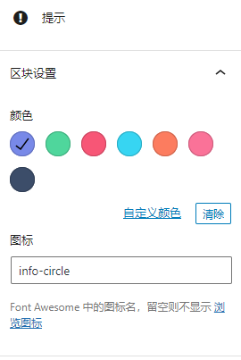
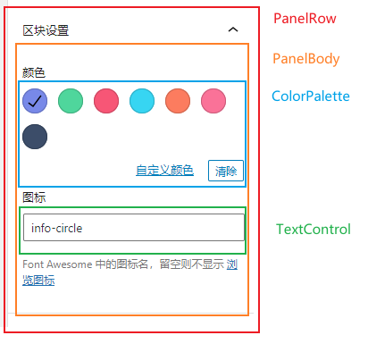
<InspectorControls key="setting">
<PanelBody title="区块设置" icon={"more"} initialOpen={true}>
<PanelRow>
<fieldset>
<PanelRow>颜色</PanelRow>
<ColorPalette
onChange={onChangeColor}
colors={[
{ name: 'argon', color: '#7889e8' },
{ name: 'green', color: '#4fd69c' },
{ name: 'red', color: '#f75676' },
{ name: 'blue', color: '#37d5f2' },
{ name: 'orange', color: '#fc7c5f' },
{ name: 'pink', color: '#fa7298' },
{ name: 'black', color: '#3c4d69' },
]}
value={props.attributes.color}
/>
</fieldset>
<fieldset>
<PanelRow>图标</PanelRow>
<TextControl
value={props.attributes.fa_icon_name}
onChange={onIconChange}
/>
<p className="help-text">
Font Awesome 中的图标名,留空则不显示
<a href="https://fontawesome.com/v4.7.0/icons/" target="_blank">浏览图标</a>
</p>
</fieldset>
</PanelRow>
</PanelBody>
</InspectorControls>
</div>
);
}实际上并没有复杂多少。InspectorControls 是编辑器的 UI 组件,会出现在右侧的区块设置栏。PanelBody、PanelRow、前者是一个可折叠块,后者是一个容器,使设置项有 padding,和其他 UI 统一。
ColorPalette 是 WordPress 的颜色选择器组件,TextControl 是输入框组件。这些组件都是我们之前从 @wordpress/components 中导入的,省去了不少手写组件的繁琐。
同样地,选项面板中的修改也被 onChangeColor、onIconChange 函数同步到了 attributes 并同步到了区块的 UI 中。
完整的例子
下面是整个 alert.js 文件:
import './editor.scss';
import {
RichText,
InspectorControls,
} from "@wordpress/block-editor";
import {
ColorPalette,
TextControl,
Panel, PanelBody, PanelRow
} from '@wordpress/components';
const { registerBlockType } = wp.blocks;
registerBlockType('argon/alert', {
title: '提示',
icon: 'warning',
category: 'argon',
keywords: [
'argon',
'提示'
],
attributes: {
color: {
type: 'string',
default: '#7889e8'
},
content: {
type: 'string',
default: ''
},
fa_icon_name: {
type: 'string',
default: 'info-circle'
},
},
edit: (props) => {
const onChangeContent = (value) => {
props.setAttributes({ content: value });
};
const onChangeColor = (value) => {
props.setAttributes({ color: (value || "#7889e8") });
}
const onIconChange = (value) => {
props.setAttributes({ fa_icon_name: value });
}
return (
<div>
<div className="alert" style={{ backgroundColor: props.attributes.color }}>
{!(isWhitespaceCharacter(props.attributes.fa_icon_name) || props.attributes.fa_icon_name == "") &&
<span className="alert-inner--icon">
<i className={`fa fa-${props.attributes.fa_icon_name}`}></i>
</span>
}
<RichText
tagName="span"
className="alert-inner--text"
placeholder="内容"
value={props.attributes.content}
onChange={onChangeContent}
/>
</div>
<InspectorControls key="setting">
<PanelBody title="区块设置" icon={"more"} initialOpen={true}>
<PanelRow>
<div id="gutenpride-controls">
<fieldset>
<PanelRow>颜色</PanelRow>
<ColorPalette
onChange={onChangeColor}
colors={[
{ name: 'argon', color: '#7889e8' },
{ name: 'green', color: '#4fd69c' },
{ name: 'red', color: '#f75676' },
{ name: 'blue', color: '#37d5f2' },
{ name: 'orange', color: '#fc7c5f' },
{ name: 'pink', color: '#fa7298' },
{ name: 'black', color: '#3c4d69' },
]}
value={props.attributes.color}
/>
</fieldset>
<fieldset>
<PanelRow>图标</PanelRow>
<TextControl
value={props.attributes.fa_icon_name}
onChange={onIconChange}
/>
<p className="help-text">
Font Awesome 中的图标名,留空则不显示
<a href="https://fontawesome.com/v4.7.0/icons/" target="_blank">浏览图标</a>
</p>
</fieldset>
</div>
</PanelRow>
</PanelBody>
</InspectorControls>
</div>
);
},
save: (props) => {
return (
<div className="alert" style={{ backgroundColor: props.attributes.color }}>
{props.attributes.fa_icon_name != "" &&
<span className="alert-inner--icon">
<i className={`fa fa-${props.attributes.fa_icon_name}`}></i>
</span>
}
<span className="alert-inner--text" dangerouslySetInnerHTML={{ __html: props.attributes.content }}></span>
</div>
);
},
});
save 函数中,因为不需要动态编辑,所以 RichText 组件被普通的 span 取代,onChange 监听回调也不需要了。
需要注意的是,设置区块内容需要使用 dangerouslySetInnerHTML 来设置,否则编辑器中的富文本会被展示为 HTML 源码。因为所有字符串都是在后台编辑器中产生,所以可以信任。
CSS
在 editor.scss 中写好样式即可。这个过程应该是伴随着写 edit 函数的。
End
npm run build 进行构建,至此,一个编辑器区块已经开发完成。
Extra
注册不同的样式变体
编辑一些区块时可以在左上角看到,一些区块有不止一个样式,例如表格有 “默认” 和 “条纹” 两种。要注册不同的样式,只需要在 registerBlockType 的第二个参数中传入 styles 数组,每一项是一个对象,有如下常用参数:
| 名称 | 是否必需 | 解释 |
| name | 必需 | 字符串,该变体的唯一标识符,也是该变体的 CSS 类名 |
| label | 必需 | 字符串,该变体的显示名称 |
| isDefault | 可选 | 布尔值,该变体是否作为默认选择 |
需要注意的是 isDefault 参数,如果所有数组项都没有它,那么将会出现一个不在变体列表中的 “默认样式”。如果设置了此项,这个 “默认样式” 即不会出现。
当切换样式变体时,实际上是切换了这个区块的额外 CSS 类名。在右侧栏中的区块高级设置中可以看见。所以给不同样式变体写 CSS 即对每个类名写 CSS。类名也会传到 props.attributes.className 和 props.className 中,可以在组件中进行处理。
很迷的是,即使你设置了 isDafault 为 true,新建区块时,Wordpress 却不会默认设置上这个变体的类名,所以需要进行手动判断。
在区块中维护可变长度列表
和在 React 组件中维护可变长度列表一样,将 attribute 的类型设为数组,对这个数组进行操作即可。


t挺好的
您好~我是腾讯云开发者社区运营,关注了您分享的技术文章,觉得内容很棒,我们诚挚邀请您加入腾讯云自媒体分享计划。完整福利和申请地址请见:https://cloud.tencent.com/developer/support-plan
作者申请此计划后将作者的文章进行搬迁同步到社区的专栏下,你只需要简单填写一下表单申请即可,我们会给作者提供包括流量、云服务器等,另外还有些周边礼物。
用了一下,感觉太复杂,属实下不去手
主题好看
这篇文章的代码高亮是怎么做的啊?
大赞
打赏一杯茶派啦!
不错
路过
总结的不错,之前在下也写过一个 Gutenberg 区块插件 ,使用区块可以更优雅的进行内容编辑以及纠错。
tqlwww贴贴